Abstract.
|
Abstraction- It is what we consider to be different or out of the ordinary towards the way we view things especially in life.
It is something that you may be able to tell what the subject is or you may not be able to tell what the subject is. It is interpreted as 'different'. |
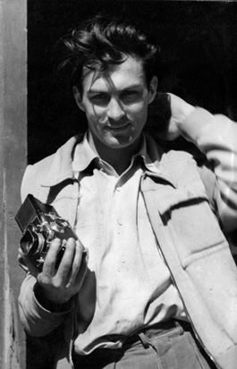
Paul Strand drawings

|
The formal elements.
Photographers are usually aware of the ways in which they can create interest in their images beyond the simple fact of the subject. This is what separates good pictures and bad pictures of the same thing. The following list describes some of the abstract elements in any photograph. Below the list is an example of how you can analyse a photograph looking for these things specifically and how this helps to give the image meaning:
|
Focus:
Light: Line: Repetition: Shape: Space: Texture: Value/Tone: |
Which areas appear clearest or sharpest in the photograph? Which do not?
Which areas of the photograph are brightest? Are there any shadows? Does the photograph allow you to guess the time of day? Is the light natural or artificial? Harsh or soft? Reflected or direct? Are there objects in the photograph that act as lines? Are they straight, curvy, thin, thick? Do the lines create direction in the photograph? Do they outline? Do the lines show movement or energy? Are there any objects, shapes or lines which repeat and create a pattern? Do you see geometric (straight edged) or organic (curvy) shapes? Which are they? Is there depth to the photograph or does it seem shallow? What creates this appearance? Are there important negative (empty) spaces in addition to positive (solid) spaces? Is there depth created by spatial illusions i.e. perspective? If you could touch the surface of the photograph how would it feel? How do the objects in the picture look like they would feel? Is there a range of tones from dark to light? Where is the darkest value? Where is the lightest? |
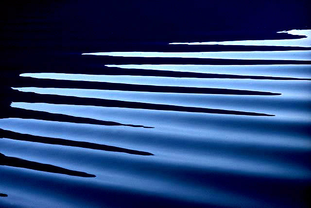
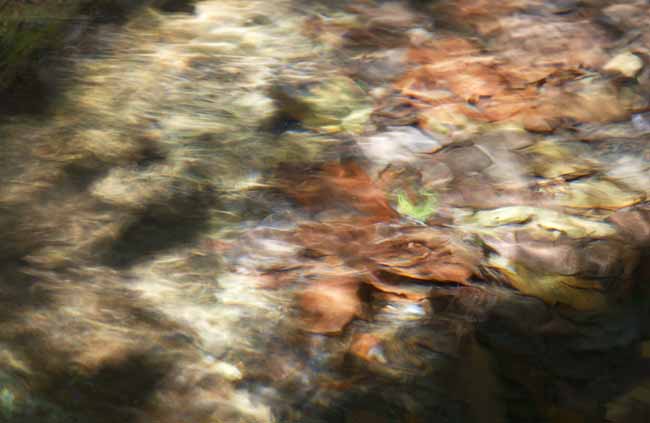
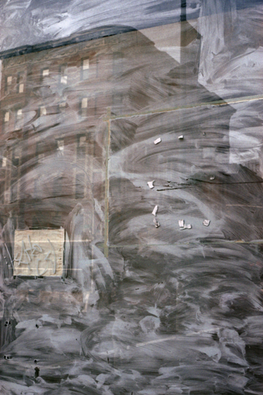
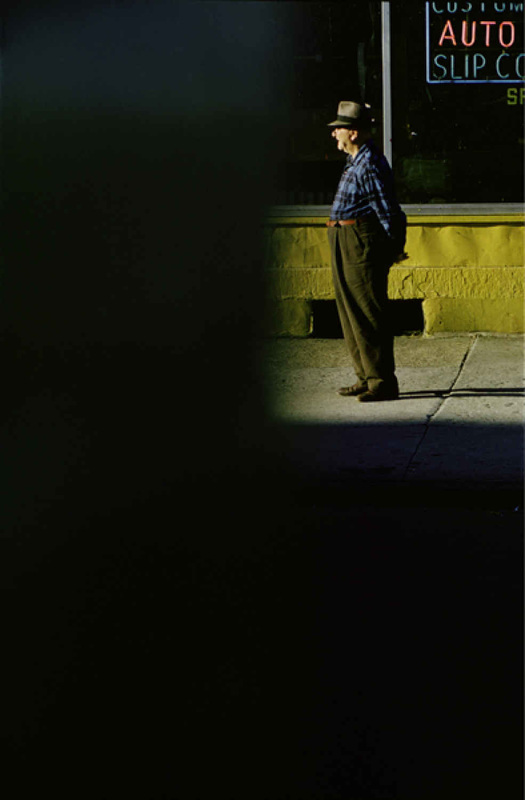
Here is Paul strands full size image named 'Abstraction, twin lakes, connecticut.

|
Focus: The whole subject is in focus. However, there is a slight softening of the focus towards the bottom of what appears to be the edge of a table top.
Light: A triangular slash of bright sunlight appears in the middle of the image. This is accompanied by bands of light running diagonally across the upper portion of the image. These appear to be gaps in another object out of shot, a fence perhaps. Line & Shape: There are number of strong lines, mostly straight, although these are complemented by the sweeping curve of the main object which runs from the top right of the image to the bottom right. All of the lines have the geometric quality of man made objects. Repetition: The shafts of sunlight running across two surfaces create a dramatic rhythm. A number if straight parallel lines are repeated in the composition, like repeated notes or beats in a piece of music. Space: The space in the image appears quite shallow, tightly constrained by the cropping. We don't the whole of any of the objects and the photographer appears to have been quite close to the subject. Texture: All of the objects in the image appear smooth. The drama comes from the jagged bursts of light across their surfaces. Value/Tone: The image contains a range of tones from very dark to very light. There are deep shadows but also mid tones. The photograph is monochrome but has a brownish tint, perhaps caused by the paper the artist has used. |
Abstract photograms.

|

|

|
|
Image 1: My first image has worked really well, however i think there are a few things i could change.
|
Image 2: this one didn't work as well as the first this is due to me leaving it exposed in the light for to little of time, therefore i would expose the image for a longer period of time. Also my objects are not showing properly creating a ghostly effect.
|
Again with my third and final image it didn't turn out as i wanted therefore i would use other objects that opaque.
|
Things to improve or change. 3 ways.
1. I could leave the images exposed to light for longer.
2. splash the chemical on to my photograms to make them look more abstract and unidentifiable.
3. My third way to improve my photograms i can use abstract shapes and natural resources as it will only show a block image even if translucent.
2. splash the chemical on to my photograms to make them look more abstract and unidentifiable.
3. My third way to improve my photograms i can use abstract shapes and natural resources as it will only show a block image even if translucent.
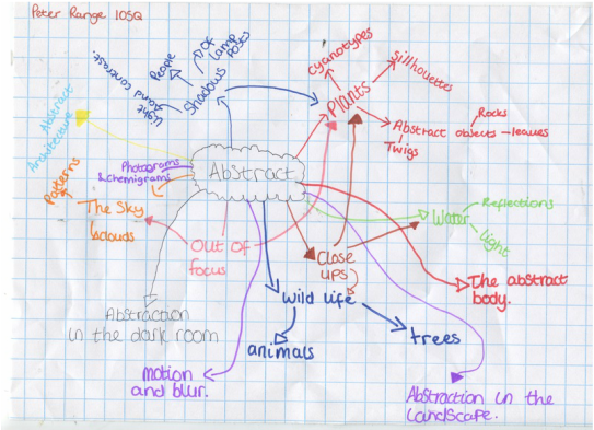
My mind map for abstraction
original photogram image.

|
This is my original image, this hasn't worked as i wanted to however after this image was cut up and remade by cutting it up and sticking it back together with sticky tape, i repeated the process and created the image below. from there i opened up photoshop and changed around with the contrast and the levels, finally i opened up the monotone scale and made it a duotone, i chose magenta as it worked the best (first image in colour).
|
creating an abstract image from original abstract photograms
From the original images from above you can see that we have cut them up both horizontally and vertically, then place them on another photogram sheet and exposed it to light again and it has created box creations.

From this image, while using photoshop, we can add colour's towards the grey areas, and by changing the contrasts you can create some good effect with 'duotone'

|
Analysis: this image has worked extremely well as the duo tone has given my image more of a trio tone effect, this is due to the contrasting i adjusted on photoshop. i also splashed the chemical on my page which has made my image look distorted. Also the colour of the pink black, and white has blended together to give other shades of pink or greys.
|
photographers into abstraction.

Harry Callahan assessment/ essay.
With in this picture I can see silhouetted trees, six to be exact with a grey background and a cream floor. The branches of all of the trees are over lapped. It almost has a christmasy feel...
if i could describe this photograph i would use simple, semi abstract, plain and somewhat, to some extent messy. If i had to describe the photograph to someone who could not see it, i would use the word unique for a start as I haven't seen anything so simple but complex at the same time. However it is colourless as it has only used shades, abstract but also has a naturalistic theme.
The 'things' that I could recognise in this image are the winter time trees and a white floor, maybe to act as snow.
The way I think that the photographer has made this image is by first taking a naturalistic photograph, then used photoshop to change the colours of the trees, the background and floor. This can affect the way we view things as the different colours represent different things for example white is innocence, purity or more literally snow, black is associated with darkness and grey is a mixture.
The lines in the picture tend to be short but straight, and simple geometric shapes are formed from these lines for example lots of: rectangles, squares, triangles and other polygons. Also the photographer has used 6 trees in a three by two formation (a nice simple pattern.)
The photographer has used some sort of photoshop to change the colours and the contrast of the image. The photographer has used block colours in his image instead of natural tones.
The thing that interests me the most about this photograph is the simplicity of it because how can something so simple look so complex at the same time as well as being able to make you think or associate the image with a certain time of year or feeling.
In this image space is in most places. However the part that strikes me as the most interesting is the trees because the branches overlay to create many geometrical shapes, which are names above.
If i could ask the photographer one question it would have to be....:
What inspired you to create these sorts of image?
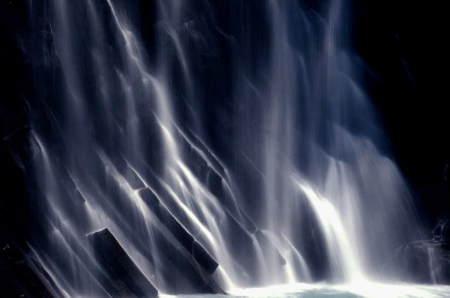
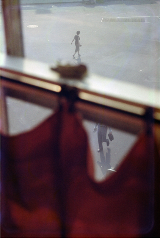
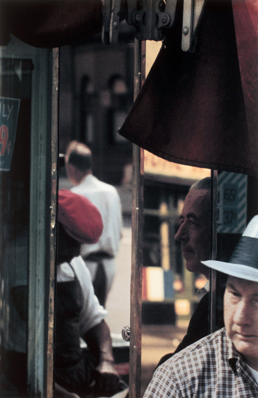
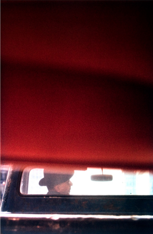
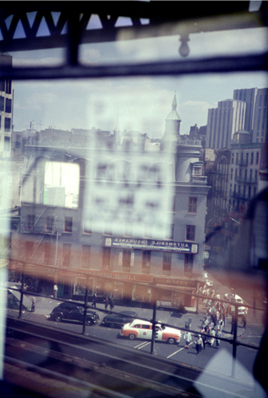
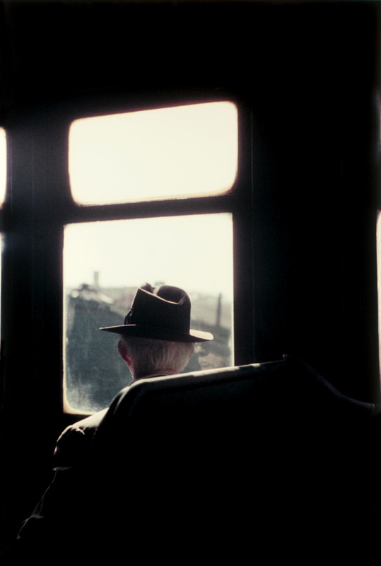
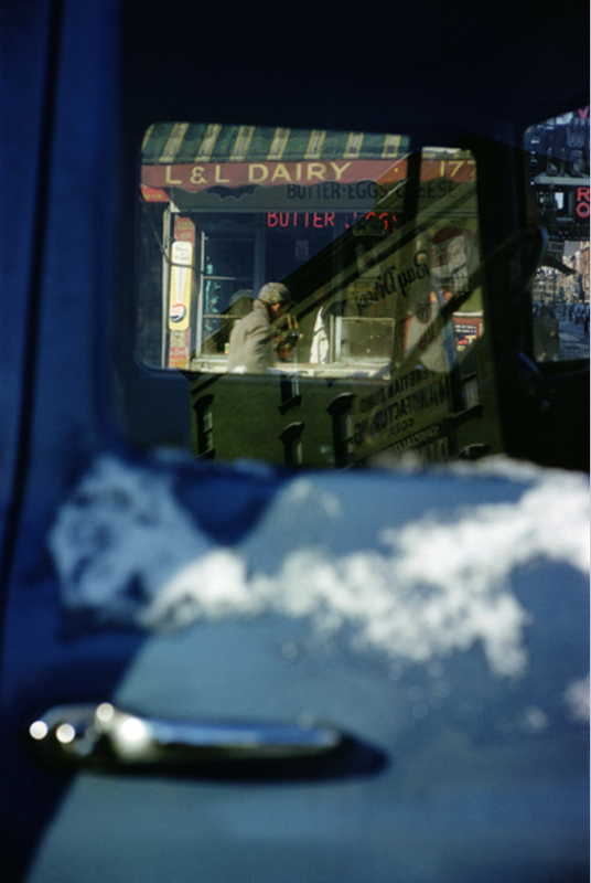
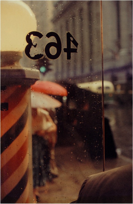
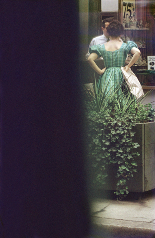
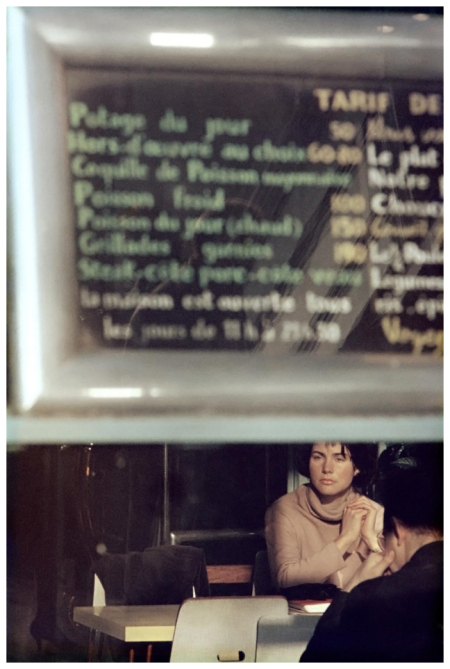
Saul Leiter
Here are some Saul Leiter images, these were a baseline in order to inspire us.
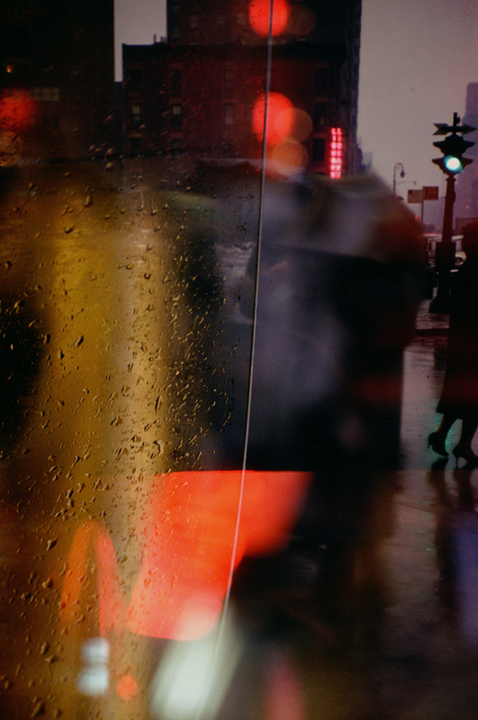
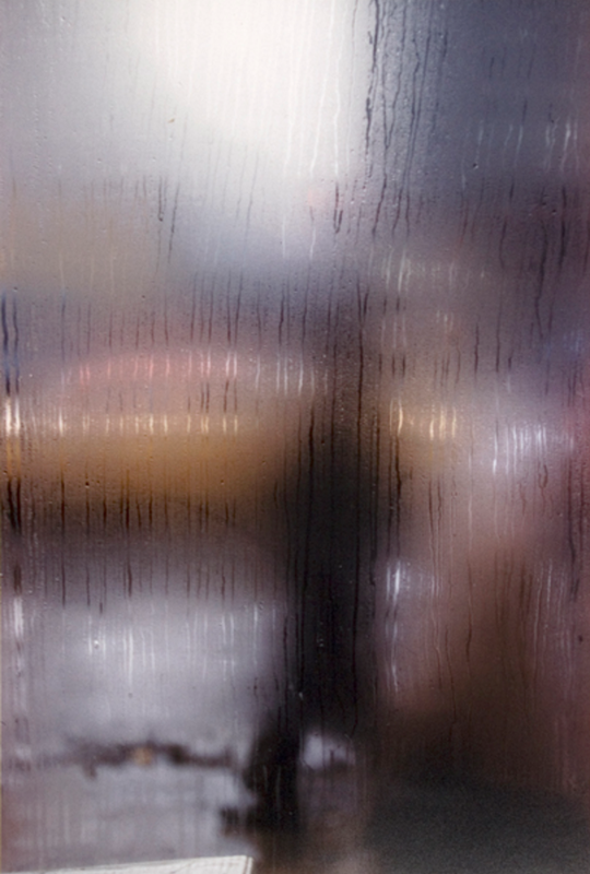
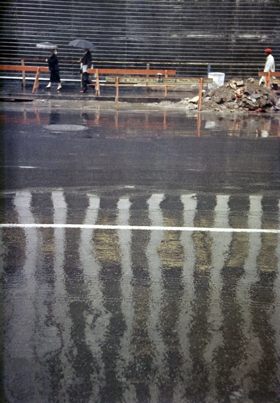
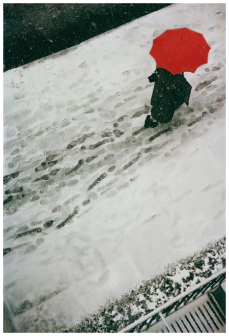
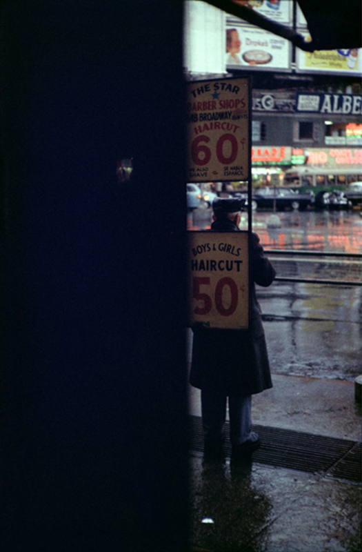
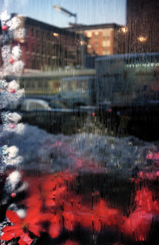
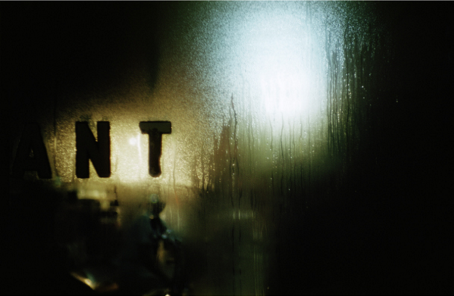
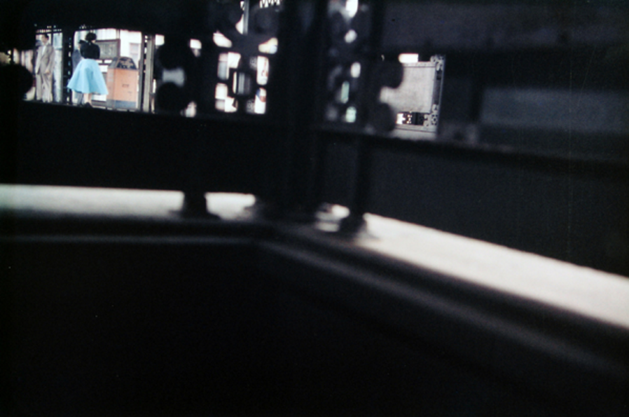
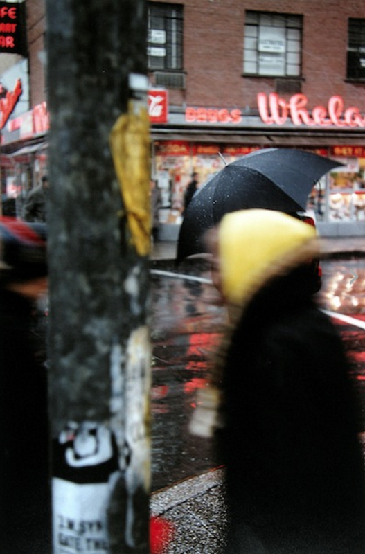
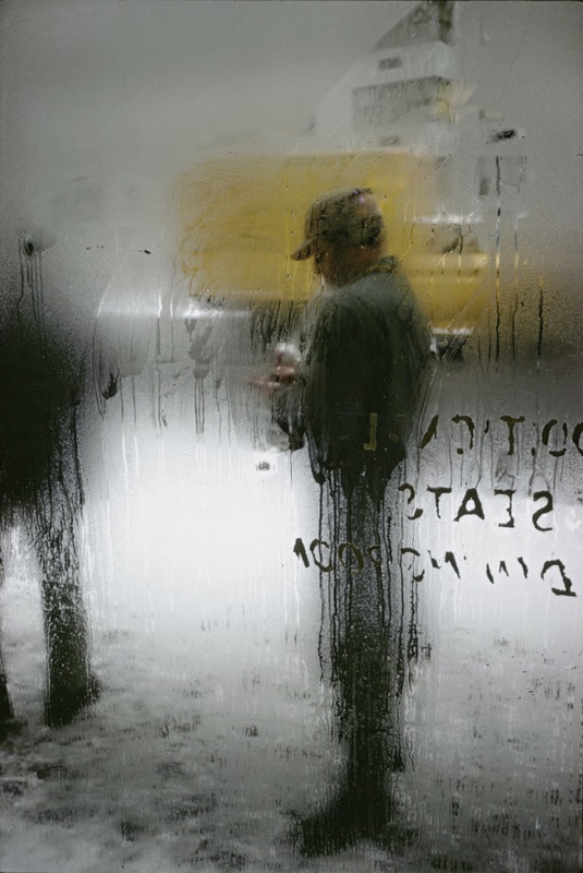
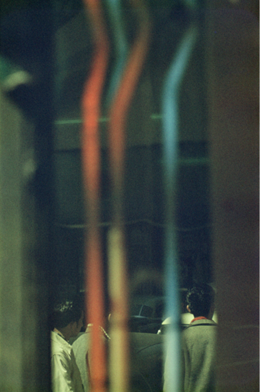
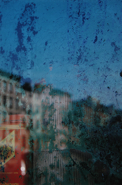
Saul Leiter Paintings.
inspirations
Below are my inspiration from Saul leiter.
Saul leiter inspirations photographs and paintings
These images are my inspirations after looking at his paintings and other photographs

other abstract photographers.
Akihiko Miyoshi interpretations below.
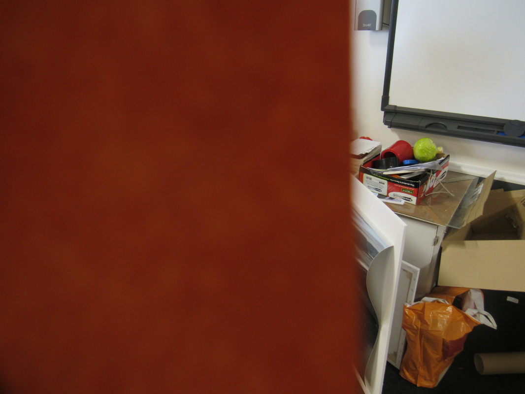
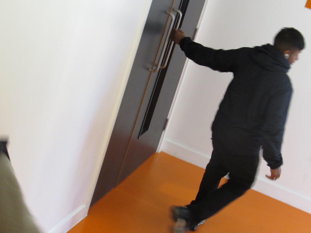
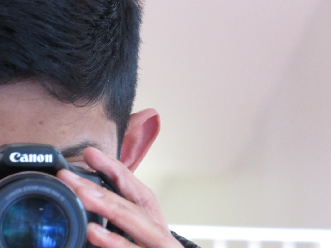
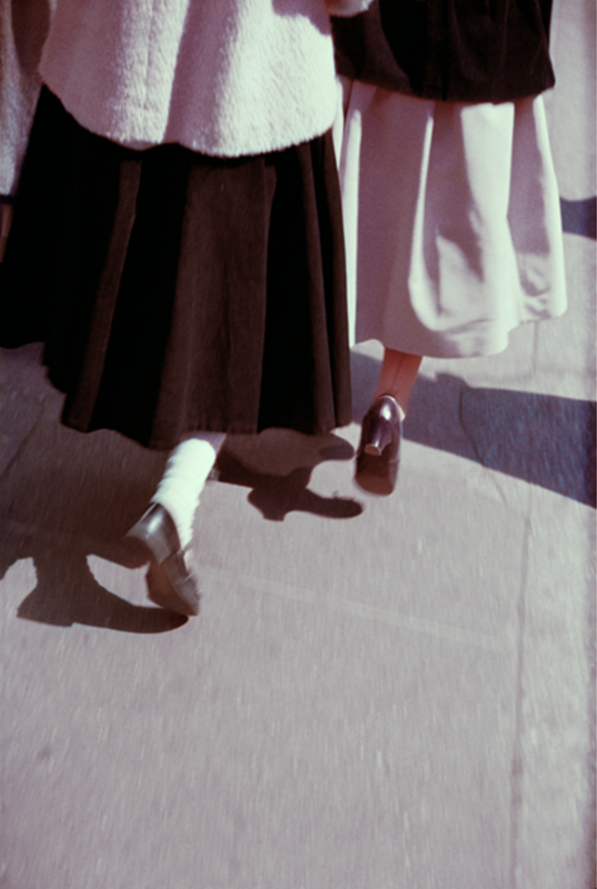
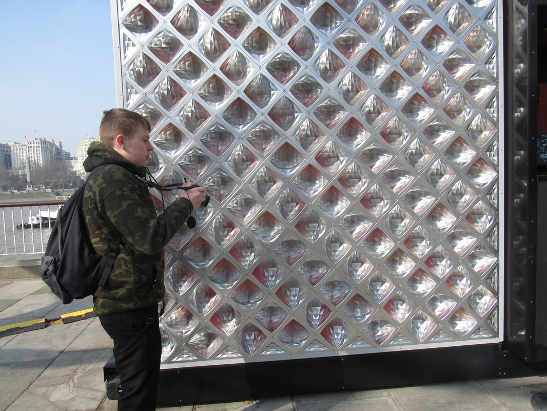
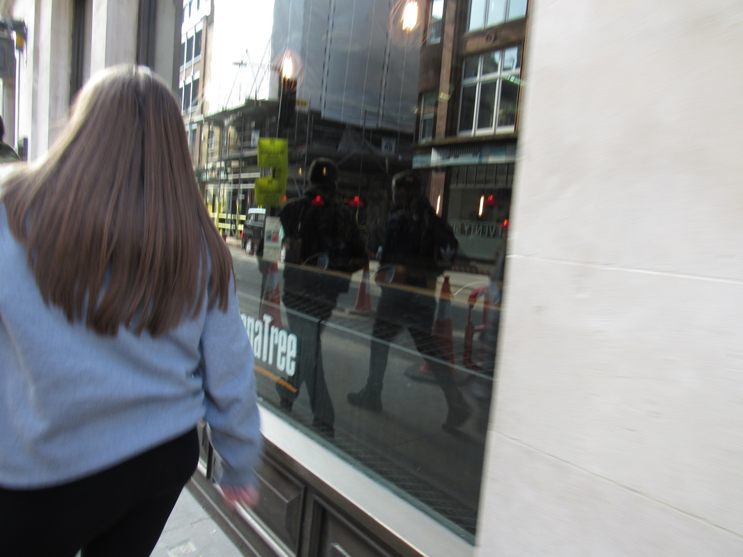
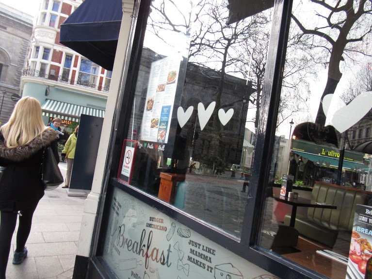
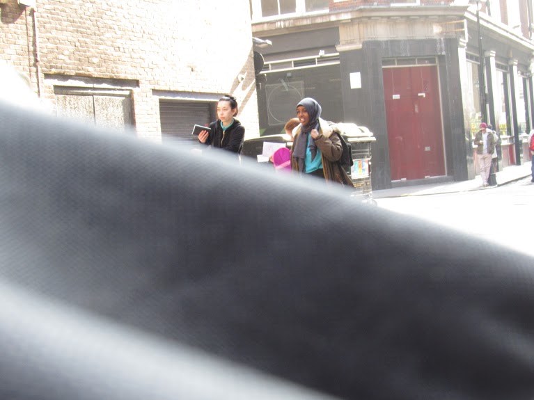
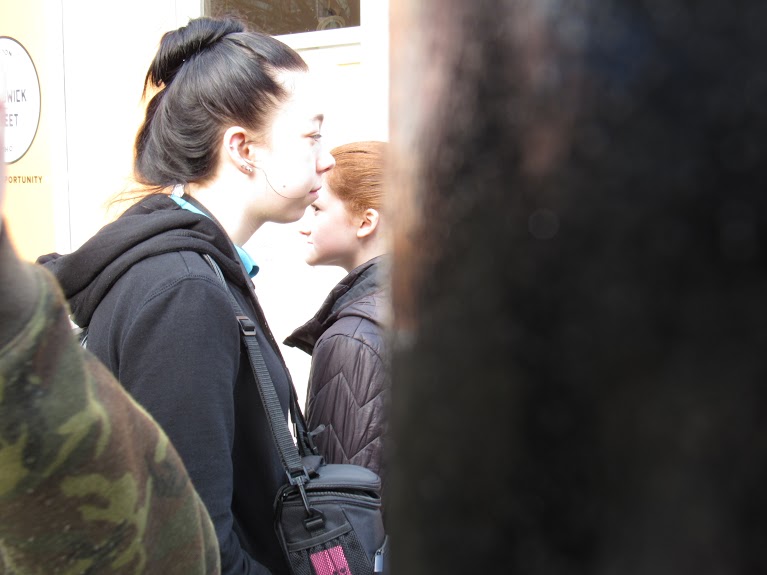
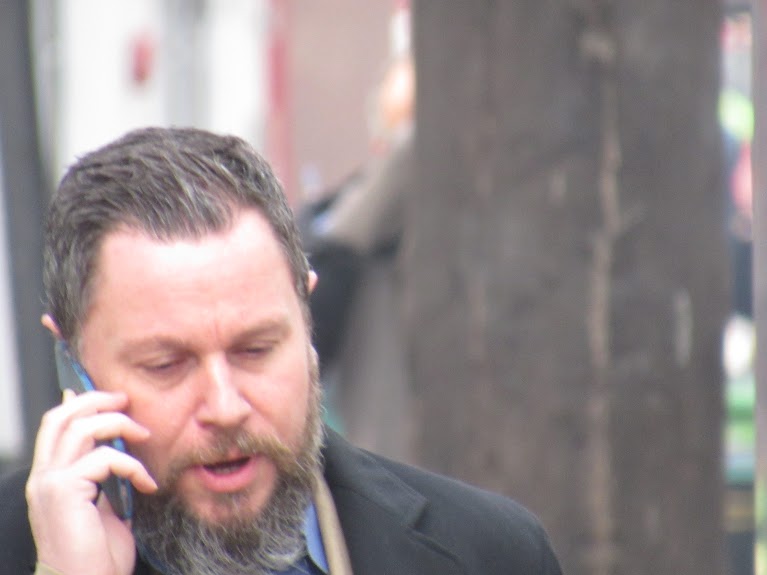
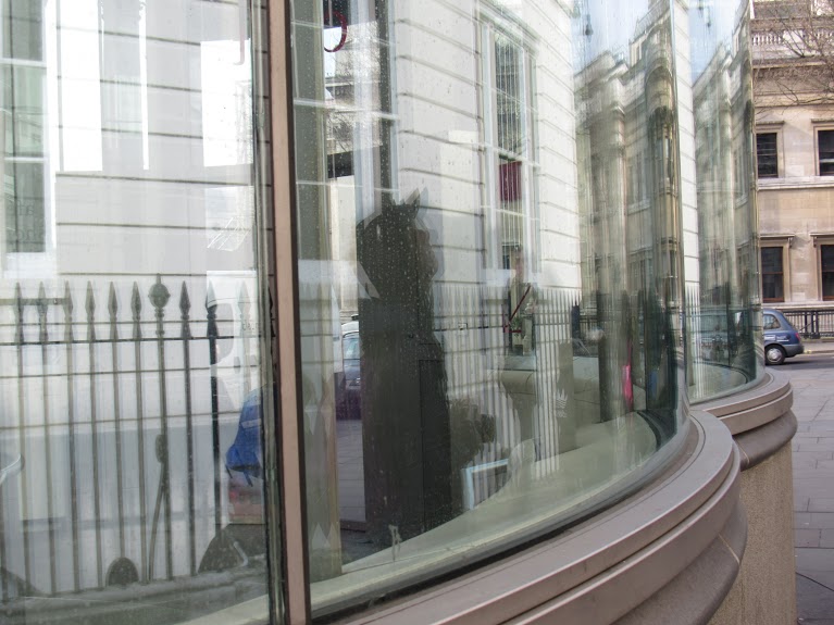
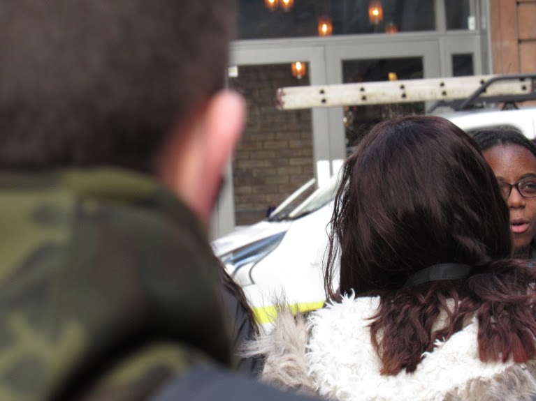
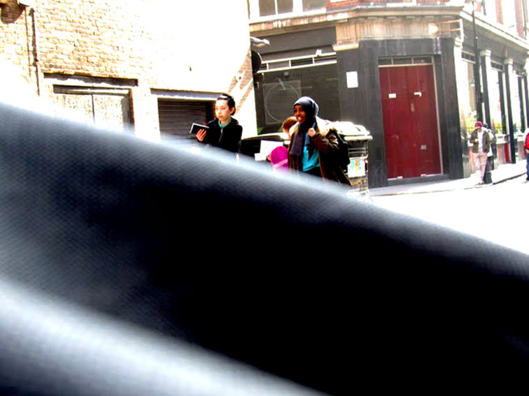
TRIP TO THE PHOTOGRAPHERS GALLERY.
|
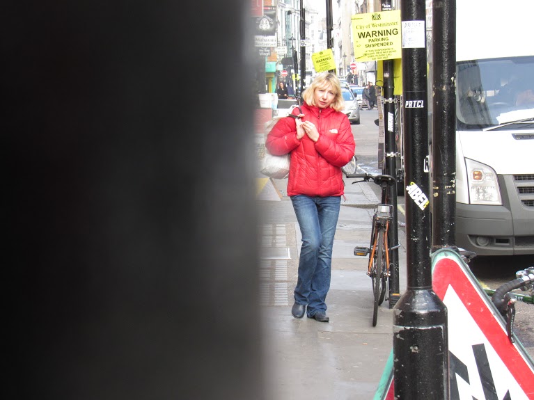
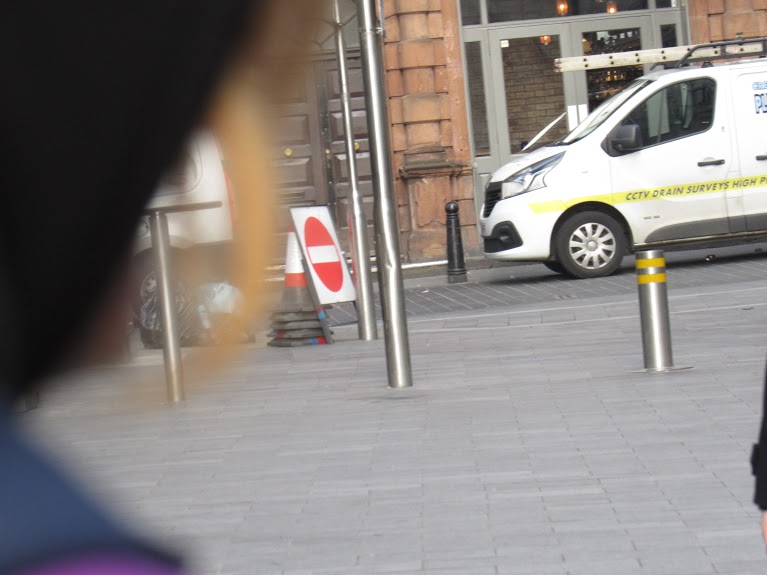
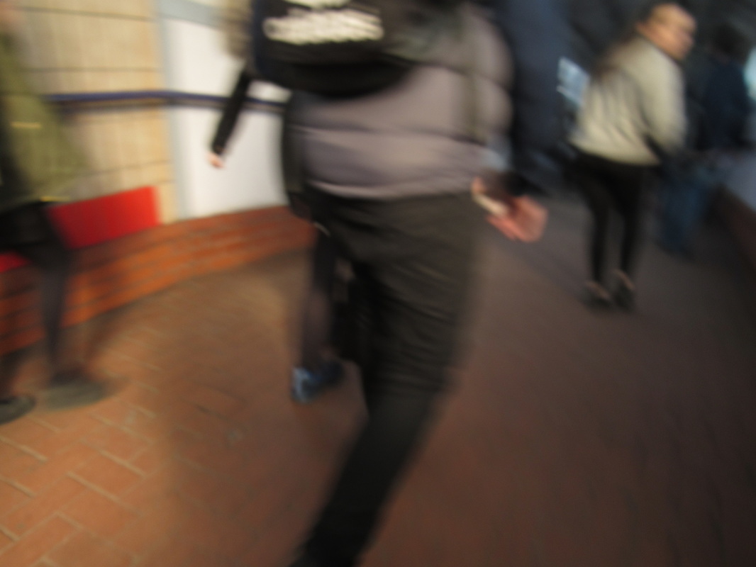
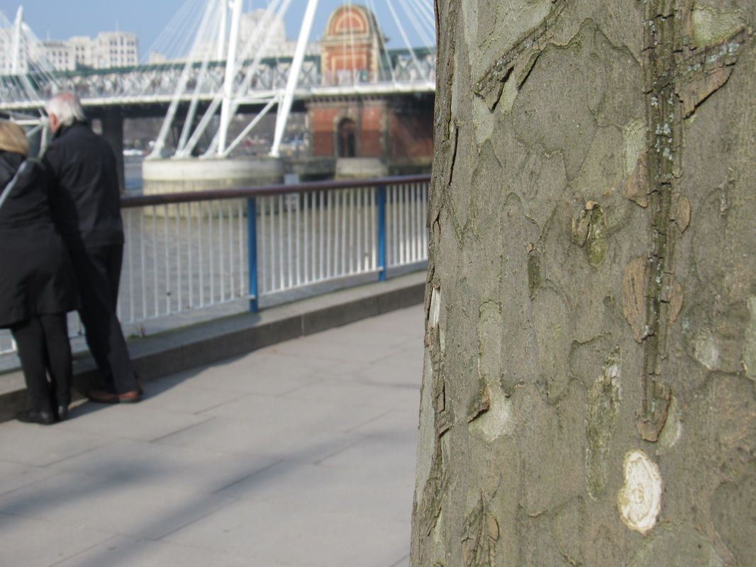
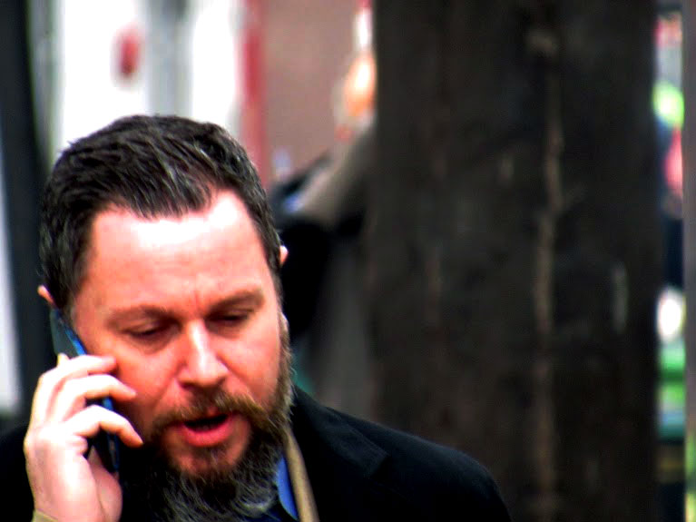
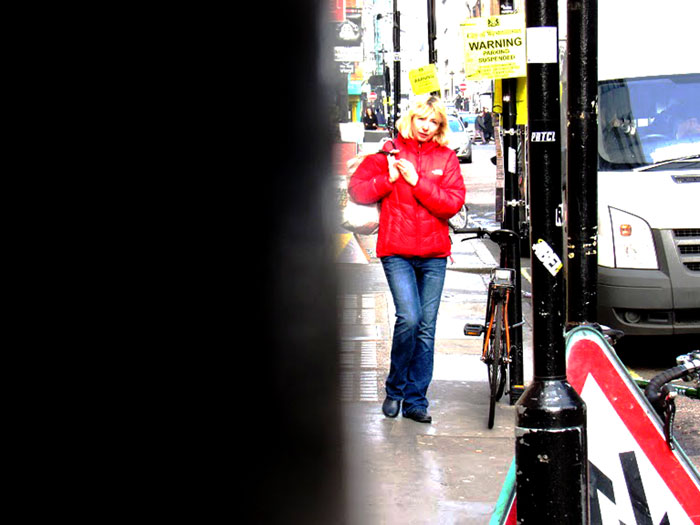
here on the left is my images from the photography
trip to the photographers gallery in London, after we looked around the gallery, we went to the south bank to take some pictures. |
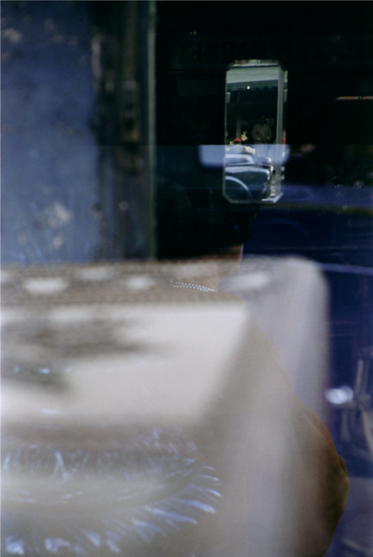
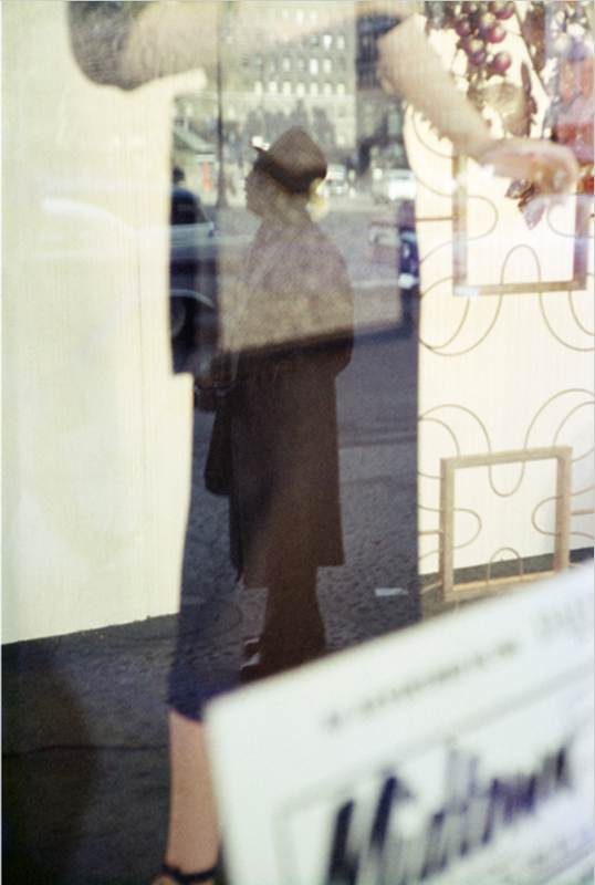
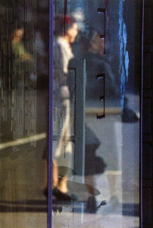
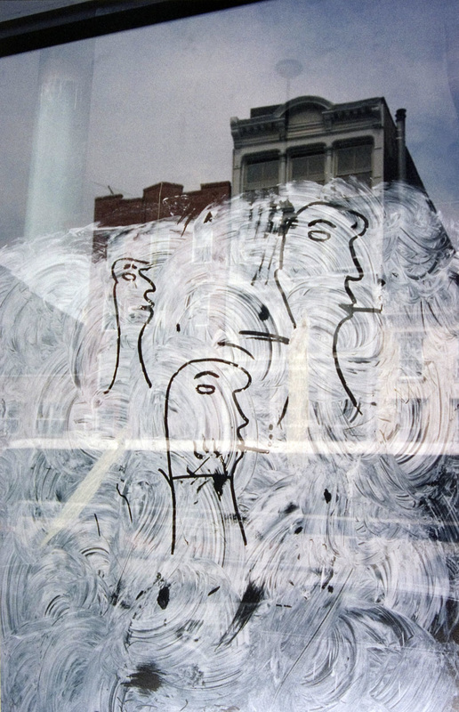
My inspiration for Saul Leiter.
From the images on the left, i chose four that i thought worked really well, went into photoshop and edited them so they look more like Saul Leiters' art work. |
|
|
|

|
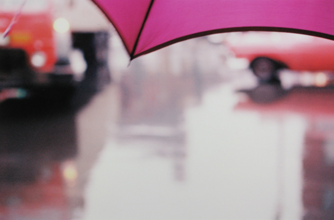
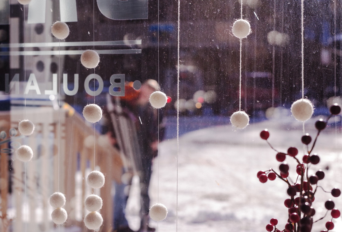
Above are my images from the photography trip, my images that i have taken have been inspired by Saul Leiter!
|
Above are my final edited pieces, i have edited this via photoshop and changing the levels of the contrast.
|
Abstraction Evaluation topic.
|
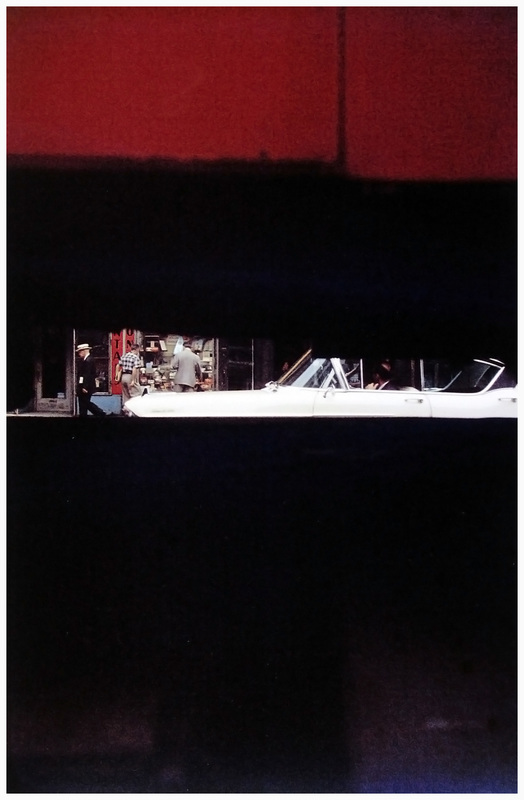
Ernst Haas: Born March 2nd 1921 but died September 12, 1986. Ernst Haas was an Austrian photojournalist and a pioneering colour photographer During his 40 year career the artist bridged the gap between photojournalism and the use of photography as a medium for creativity and expression. Ernst Haas was an early innovator of colour photography magazines widely disseminated by magazines such as vogue and life, and in 1962 were the subject of the first single artist exhibition of colour photography at new yorks museum of modern art. Ernst Haas even released a book called the creation in 1971 and it was one of the most successful photography books ever to be sold, selling over 350,000 copies. Below is some of Ernst Haas photography.
|